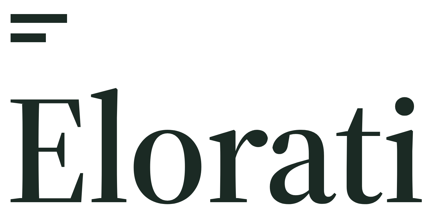
Stacked Lockup (Primary)
Paper / Light
Ochre two-bar colophon above the Forest wordmark. Default choice for covers, documents, and light backgrounds.
Elorati / Brand · Direction III: Marker · MMXXVI
Official logos, two-bar colophon marks, practice lockups, palette values, type specimens, and CSS tokens. Every downloadable SVG lockup is outlined to vector paths so it renders cleanly across browsers, decks, Figma, and print without installing fonts.
I · Primary Lockups
The stacked lockup is primary. Use the horizontal lockup in narrow placements such as navigation bars, slide footers, and email signatures. Pick the reversed variant on dark backgrounds.
Ochre two-bar colophon above the Forest wordmark. Default choice for covers, documents, and light backgrounds.
Ochre colophon paired with the Paper wordmark on a transparent ground. Built for Forest, Ink, and dark slide decks.
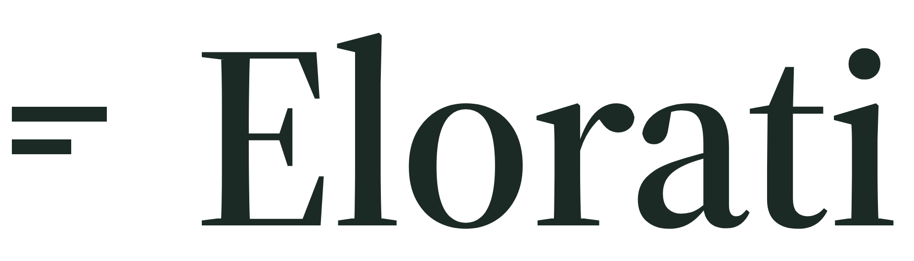
Colophon centered against the wordmark x-height. Built for headers, signatures, partner grids, and narrow bands.
Ochre colophon and Paper wordmark on transparent background for dark headers, footers, and presentation title bars.
Single-Color Reproductions (Stamps, Print, Embroidery, Monochrome)
II · Colophon & Standalone Wordmark
The colophon consists of two stacked horizontal bars: upper bar at full width, lower bar at 62% width. Use it as a quiet signature in footers, favicons, and product chrome where Elorati is already named.


Dark-surface colophon mark for Forest, Ink, and client site footers.

Single-color ink mark, plus mark.svg in currentColor for inline HTML.
Source Serif 4 SemiBold at optical size 60, converted to vector outlines for light surfaces.

Outlined Paper wordmark for dark surfaces when the colophon is placed separately.
III · Practice Sub-Brands
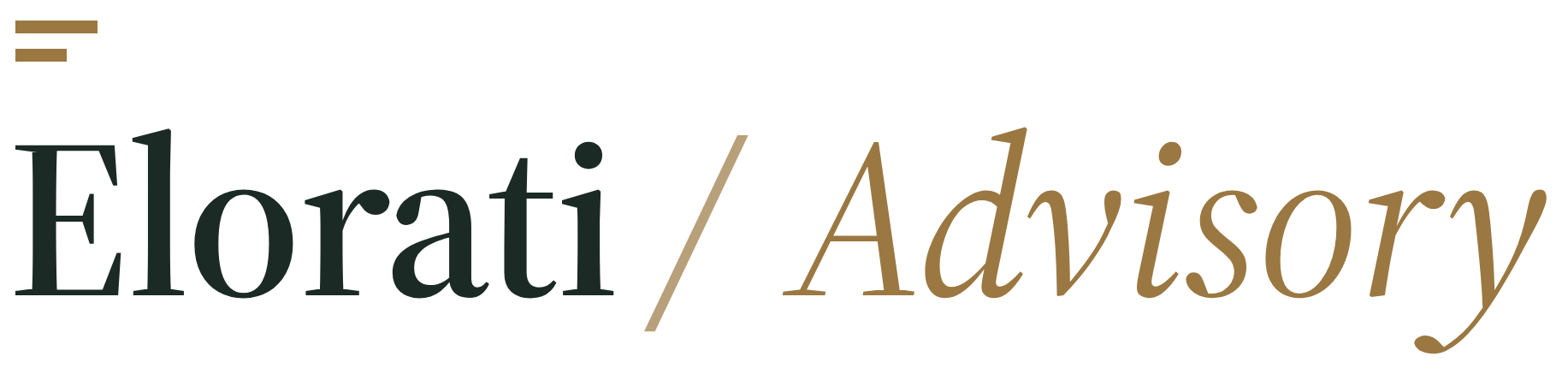
Master brand always leads: write Elorati / Advisory, never Advisory by Elorati. The divider and practice name sit in Source Serif 4 Italic 400 in the practice accent.
Embedded strategy, AI governance, and executive advisory engagements.
Fixed-scope custom software, integrations, automations, and internal tools.
Build-then-manage operations: hosting, monitoring, iteration, and support.
IV · Avatars, Icons & Social Cards
App icons, GitHub and social profile avatars, browser favicons, and the site-wide 1200×630 social preview card.

Forest field with Paper bars. Used for app icons, workspaces, Slack, GitHub organizations, and JSON-LD schema.

Pre-masked circular badge for social profiles, podcasts, and directory listings on light or transparent grounds.
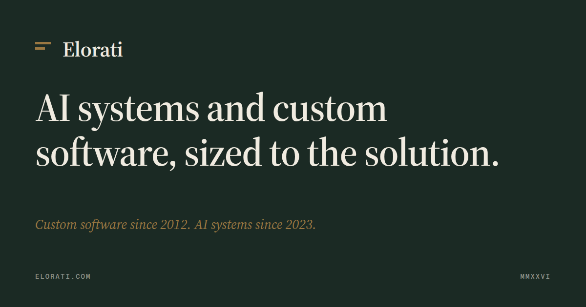
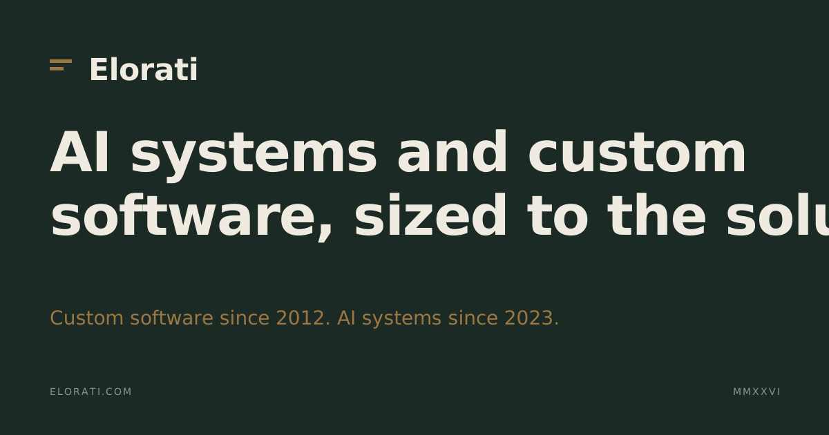
Site-wide social preview card on Forest ground. Editable SVG source plus pre-rendered PNG for social crawlers.

Optical proportions tuned for 16px and 32px browser tabs while holding crisp edges at 512px.
V · Color Palette & Surface Balance
Click any swatch to copy its hex value. Ochre is seasoning, never a fill: cap it at roughly six percent of any screen, and use Forest for primary buttons.
Primary Palette
Extended Neutrals & Practice Accents
VI · Typography, Space & Rules
Serif display headlines, clean neo-grotesque body copy, and tracked uppercase monospace metadata. Never mix those roles.
SemiBold 600 at optical size 60, tracking -0.012em, line-height 1.0 to 1.1. Italic 400 is reserved for a single emphasized word or sub-brand divider.
Regular 400 for long-form prose and descriptions; Medium 500 for buttons, card titles, and form labels. Line-height 1.6.
Geist Mono Medium 500, uppercase, 0.14em letter-spacing. Used above headlines, on badges, file tags, and tabular figures.
Clear Space & Minimum Size
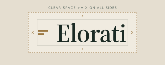
Maintain clear space of at least X (the height of the upper colophon bar) on every side of any lockup. Minimum width is 18px for the wordmark height (roughly 84px wide) and 16px for the standalone mark.
Elorati / Advisory, Elorati / Studio, and Elorati / Managed. Never invert to "Advisory by Elorati."
#F0EBE0), Paper-2 cards (#E5DED0), 1px hairline borders, and 2px to 4px corners.
I, II, III, MMXXVI). Sentence case in UI.
VII · Tokens, Design Brief & File Manifest
Import tokens.css into any web project, copy the Marker design brief into an AI design session, or grab any individual file below.
:root {
  /* Primary palette */
  --elorati-forest:   #1B2A24;
  --elorati-paper:    #F0EBE0;
  --elorati-ochre:    #9B7842;
  --elorati-moss:     #6F7A72;

  /* Extended neutrals */
  --elorati-paper-2:  #E5DED0;
  --elorati-ink:      #0D1310;
  --elorati-muted:    #6A6258;
  --elorati-line:     rgba(27, 42, 36, 0.16);

  /* Sub-brand accents */
  --elorati-advisory:   #9B7842;
  --elorati-properties: #3A4A40;
  --elorati-capital:    #6F5A38;

  /* Type stacks */
  --elorati-display: 'Source Serif 4', Georgia, serif;
  --elorati-text:    'Geist', -apple-system, sans-serif;
  --elorati-mono:    'Geist Mono', ui-monospace, monospace;
}
ELORATI DESIGN SYSTEM (Direction 03: Marker)
Aesthetic: warm editorial print. Bone paper (#F0EBE0), deep forest ink (#1B2A24),
a quiet ochre colophon (#9B7842, capped at ~6% of any surface), moss (#6F7A72)
for tracked uppercase Geist Mono eyebrows.

Type:
- Display: Source Serif 4 SemiBold 600 (opsz 60), tracking -0.012em, lh 1.0-1.1
- Body/UI: Geist 400 / 500, lh 1.6
- Eyebrows: Geist Mono 500, uppercase, letter-spacing 0.14em

Surface rules:
- Cards use #E5DED0 with 1px solid rgba(27,42,36,0.16), radius 4px, zero shadow
- Primary buttons use #1B2A24 fill with #F0EBE0 text (hover #0D1310)
- No gradients, no glow, no pills, no exclamation points, roman numerals (I, II, III)
- Sub-brands: "Elorati / Advisory", "Elorati / Studio", "Elorati / Managed"
| Asset | Intended Surface & Notes | Downloads |
|---|---|---|
| Stacked Lockup (Primary) | Paper and light surfaces; Ochre bars + Forest wordmark | SVG PNG |
| Stacked Lockup (Reversed) | Forest and dark surfaces; Ochre bars + Paper wordmark | SVG PNG |
| Stacked Lockup (One-Color Forest) | Single-color dark ink reproduction | SVG PNG |
| Stacked Lockup (One-Color Paper) | Single-color light knockout on dark grounds | SVG PNG |
| Horizontal Lockup | Narrow light placements: navs, headers, email signatures | SVG PNG |
| Horizontal Lockup (Reversed) | Narrow dark placements: dark headers, slide footers | SVG PNG |
| Horizontal Lockup (One-Color Forest) | Single-color dark ink horizontal lockup | SVG PNG |
| Horizontal Lockup (One-Color Paper) | Single-color light horizontal knockout | SVG PNG |
| Standalone Wordmark (Forest) | Outlined wordmark without colophon for light surfaces | SVG PNG |
| Standalone Wordmark (Paper) | Outlined wordmark without colophon for dark surfaces | SVG PNG |
| Colophon Mark (Ochre) | Default two-bar mark (#9B7842) for light surfaces | SVG PNG |
| Colophon Mark (Paper) | Dark-surface two-bar mark (#F0EBE0) | SVG PNG |
| Colophon Mark (Forest & currentColor) | Single-color ink mark (#1B2A24) and inline currentColor SVG | SVG PNG currentColor |
| Elorati / Advisory Lockups | Practice lockup in Ochre (#9B7842), light and reversed | SVG PNG Dark SVG Dark PNG |
| Elorati / Studio Lockups | Practice lockup in Deeper Forest (#3A4A40), light and reversed | SVG PNG Dark SVG Dark PNG |
| Elorati / Managed Lockups | Practice lockup in Warm Bronze (#6F5A38), light and reversed | SVG PNG Dark SVG Dark PNG |
| Square Avatar & App Tile | Forest square with Paper bars (SVG, 1024px PNG, 512px PNG) | SVG 1024px 512px |
| Circular Social Avatar | Forest circle with Paper bars (SVG, 1024px PNG) | SVG 1024px |
| Favicon | Browser tab mark (SVG, 512px PNG, 32px PNG) | SVG 512px 32px |
| Open Graph Social Card | 1200×630 share image and editable SVG template | SVG PNG |
| Identity CSS Tokens & Design System Brief | CSS custom properties and paste-ready design specification | tokens.css brand-tokens.css DESIGN-SYSTEM.md |